Flex布局学习
一、Flex布局是什么?
Flex是Flexible Box 的缩写,意为“弹性布局”。
指定为Flex布局:
//块级
.box {
    display:flex;
}
//行内元素
.box {
    display: inline-box;
}
注意:设为Flex 布局之后,子元素的float、 clear和vertical-align属性都失效。
二、基本概念
父元素:Flex容器; 子元素: Flex项目。
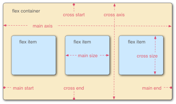
水平轴: main start - main end
交叉轴:cross start - cross end
三、容器属性
6个属性:
-
flex-direction: row row-reverse column column-reverse -
flex-wrap: nowrap warp wrap-reverse - flex-flow:
| -
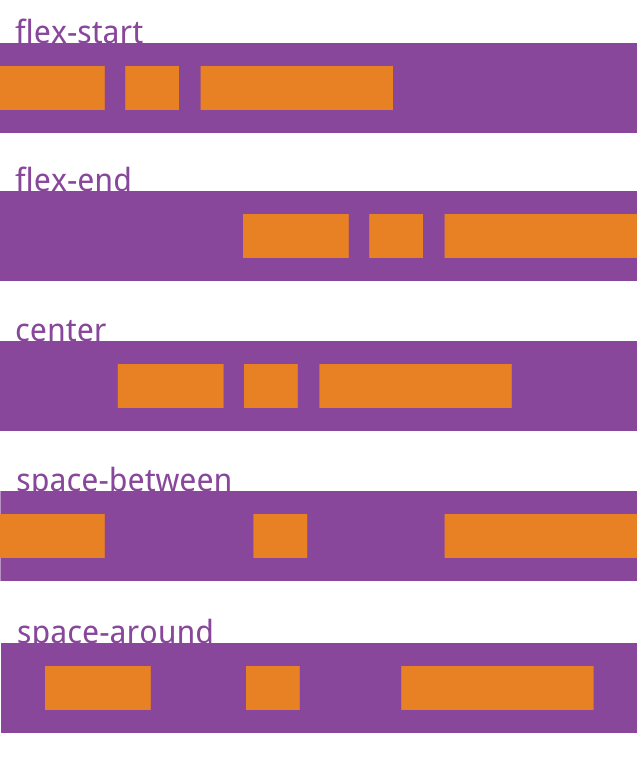
justify-content: flex-start flex-end center space-between space-around -
align-item: flex-start flex-end center baseline stretch -
align-content: flex-start flex-end center space-between space-around stretch
3.1 flex-direction(决定主轴的方向)
.box {
	flex-direction: row | row-reverse | column | column-reverse
}
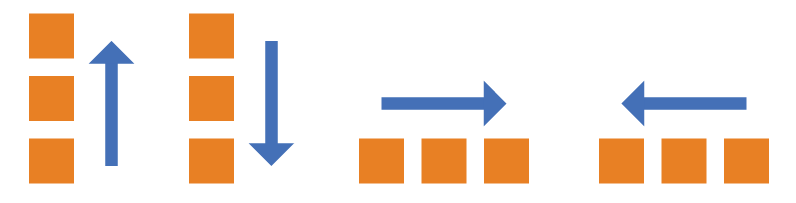
row: 水平方向 起点在左边
row-reverse: 水平方向 起点在右边
column: 垂直方向 起点在上
column-reverse: 垂直方向 起点在下
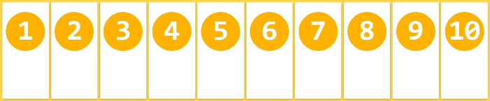
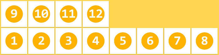
3.2 flex-wrap (如果一条轴线放不下,如何换行)
.box{
	flex-wrap: nowrap | wrap | wrap-reverse
}
(1)nowrap(默认):不换行。
(2)wrap:换行,第一行在上方。

(3)wrap-reverse:换行,第一行在下方。
3.3 flex-flow (flex-direction 和 flex-wrap 的简写, 默认值: row nowrap)
.box {
	flex-flow: <flex-direction> | <flex-wrap>
}
3.4 justify-content (项目在主轴上的对齐方式)
.box{
	justify-content:
		flex-start | 左对齐
		flex-end   | 右对齐
		center     | 中间对齐
		space-between | 两端对齐,项目之间间隔相等
		space-around  | 项目两侧间隔相等, 项目之间的间隔比项目与边框的间隔多一倍
}
3.5 align-item (项目在交叉轴上如何对齐)
.box {
	align-item:
		flex-start | 起点对齐
		flex-end   | 终点对齐
		center     | 中点对齐
		baseline   | 项目的第一行文字的基线对齐
		stretch    | 如果项目没有设置高度或设置为auto , 占满整个容器的高度
}
3.6 align-content( 多根轴线的对齐方式, 只有一根此属性无效)
.box {
	align-content:
		flex-start   |   起点
		flex-end	 |   终点
        center		 |   中点
        space-between|   两端对齐
        space-around |   间隔相等
        stretch      |   轴线沾满整个交叉轴
}
四、项目的属性
6个属性
- order
- flex-grow
- flex-shrink
- flex-basis
- flex
- align-self
4.1 order (项目的排列顺序, 数值越小越靠前)
.item {
	order: <integer>
}
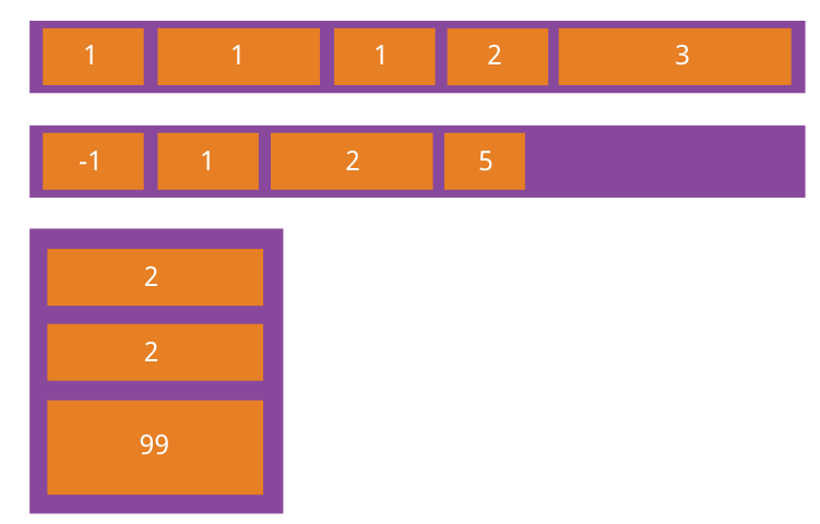
4.2 flex-grow (项目的放大比例)
.item {
	flex-grow: <number>
}
如果所有项目的flex-grow属性都为1,则它们将等分剩余空间(如果有的话)。如果一个项目的flex-grow属性为2,其他项目都为1,则前者占据的剩余空间将比其他项多一倍。
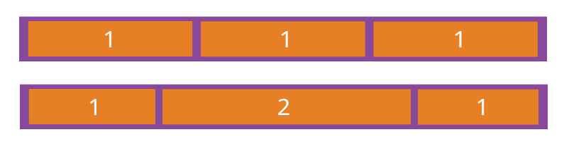
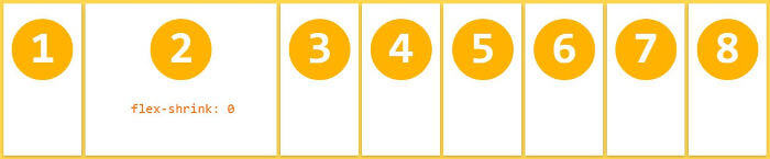
4.3 flex-shrink (项目的缩小比例)
.item {
	flex-shrink: <number>
}
4.4 flex-basis (分配多余空间之前,项目占据的主轴空间)
.item {
	flex-basis: <length> | auto
}
4.5 flex (flex-grow ,flex-shrink ,flex-basis 的简写)
.item {
    //  default: 0 1 auto
    //  none:    0 0 auto
    //  auto:    1 1 auto
	flex: none| auto| <flex-grow> <flex-shrink> <flex-basis>
}
4.6 align-self (单个项目的对齐方式, 覆盖align-items属性)
.item {
  align-self: auto | flex-start | flex-end | center | baseline | stretch;
}